
|
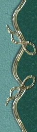
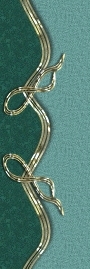
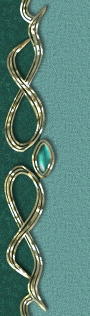
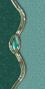
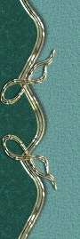
This is how the set will look with all of the expander images and one additional side image used. These are added to both the left and right borders. Perhaps you won't want your pages this long. I created this page with all of the expander elements to make it easier for you to identify them, see where they go and what they do. It is a mix and match thing. The expanders allow many possibilities but it is important to match the correct ones as it won't have a seamless effect if not used properly. Depending upon the effect you are trying to achieve not all images will be used. On the previous page, without the top left and right side expanders there is a small portion of the side that is used, although it's not used here. All of these elements are in the zip file and are clearly titled..(I hope)..but if you would like to use this and find it confusing please let me know. E-mail me and I can identify the elements for you.
The matching title plaque in the zip file is blank to allow you to add the title of your site or just "welcome" if you like. Also included in the zip file are the buttons you see here as well as the other usual and a few unusual ones. The basic navigational and contact buttons are a part of the base image and would appear on each page.
As I stated before the important thing is to keep your text within the table cell I have indicated in the source code. Even at that, if you add too much text or too many images the cell will spread and the borders will not be smooth. Not to worry you can correct that by removing some of the text or images and creating another page. Again if you run into a snag let me know.
If you have a WYSIWYG editor you may find this easier to work with although all editors do not view documents exactly the same. If you don't have one, I'd highly recommend Macromedia's Dreamweaver 2 for it's ease of use and extensive tools. Although a little pricey it can perform wonders and it's interface is very easy to understand.
The
font used is Esperanza
Close this window to return to the first page view. |